
Graphic Design Assistance
How to Optimize Your Graphic Designs for Web and Print: Best Practices
Discover how to optimize your graphic designs for both web and print with our best practices. Learn about color harmony, typography, and prototyping to ensure your visuals shine across all platforms.
Mar 20, 2026
7 min read
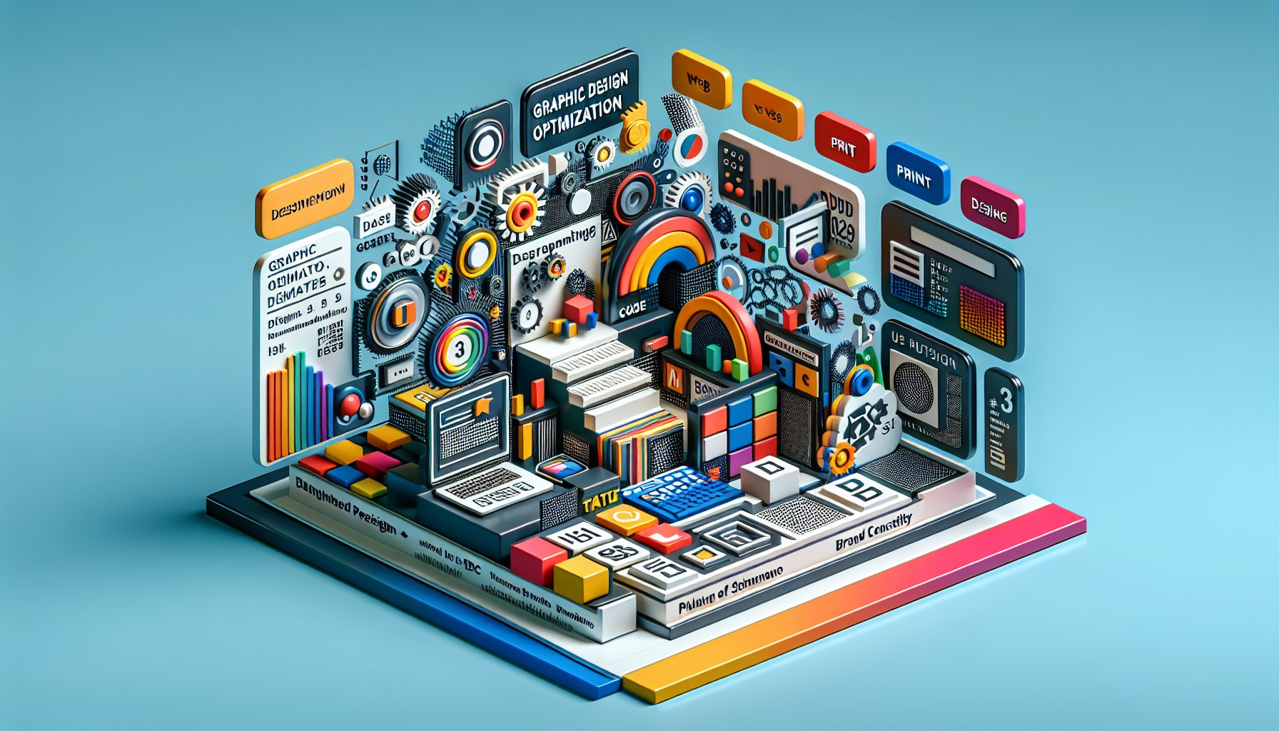
Blending Pixels and Print: A Comprehensive Guide to Graphic Design Optimization
In today's dynamic graphic design landscape, pixels and print are like two dance partners in a complex choreography. They need to move in sync, ensuring that stunning digital artworks effortlessly transition into tangible printed materials. For CT Marketing Solutions, where branding pulses through every vein, understanding this dance is essential. The challenge? Making sure every pixel and every brushstroke maintains its flair across multiple mediums.
Optimizing graphic designs isn't just about tweaking image sizes or converting file formats. It's an art. A precise blend of digital savvy and print expertise. It's about more than just pixels on a screen or ink on a page. It's ensuring that the visual magic remains intact, regardless of the format.
1. The Duality of Design: Understanding Web vs. Print
Welcome to the double life of design! On one hand, you have the fast-paced, screen-driven universe of web design, a thrilling rollercoaster of clicks and swipes. On the other, the timeless, tactile world of print design invites you to slow down, touch, and linger. It's like balancing a spirited digital zine with the timeless allure of a coffee-table book. At CT Marketing Solutions, we guide businesses through this intricate maze, helping them navigate the distinct demands of each realm.
Web design is all about vibrant screens and interactivity. It's the digital party where RGB (Red, Green, Blue) colors steal the show, creating dazzling displays that captivate users. Think of it as a digital firework display. But shift your gaze to print, and it's all about CMYK (Cyan, Magenta, Yellow, Black) colors, where inks blend with elegance to produce rich, nuanced hues, a classic masterpiece in waiting. Here, resolution becomes a crucial player, with a minimum of 300 DPI ensuring every print sings with clarity.
Ah, the approval loop! Whether you're transferring from web to print or vice versa, the iterative dance for client sign-offs can feel like a never-ending waltz. Yet, understanding these differences lays the foundation for marketing collateral that works like a charm across platforms. With its unique balance of creativity and technicality, CT Marketing Solutions knows how to make your designs not just look good but also perform brilliantly.
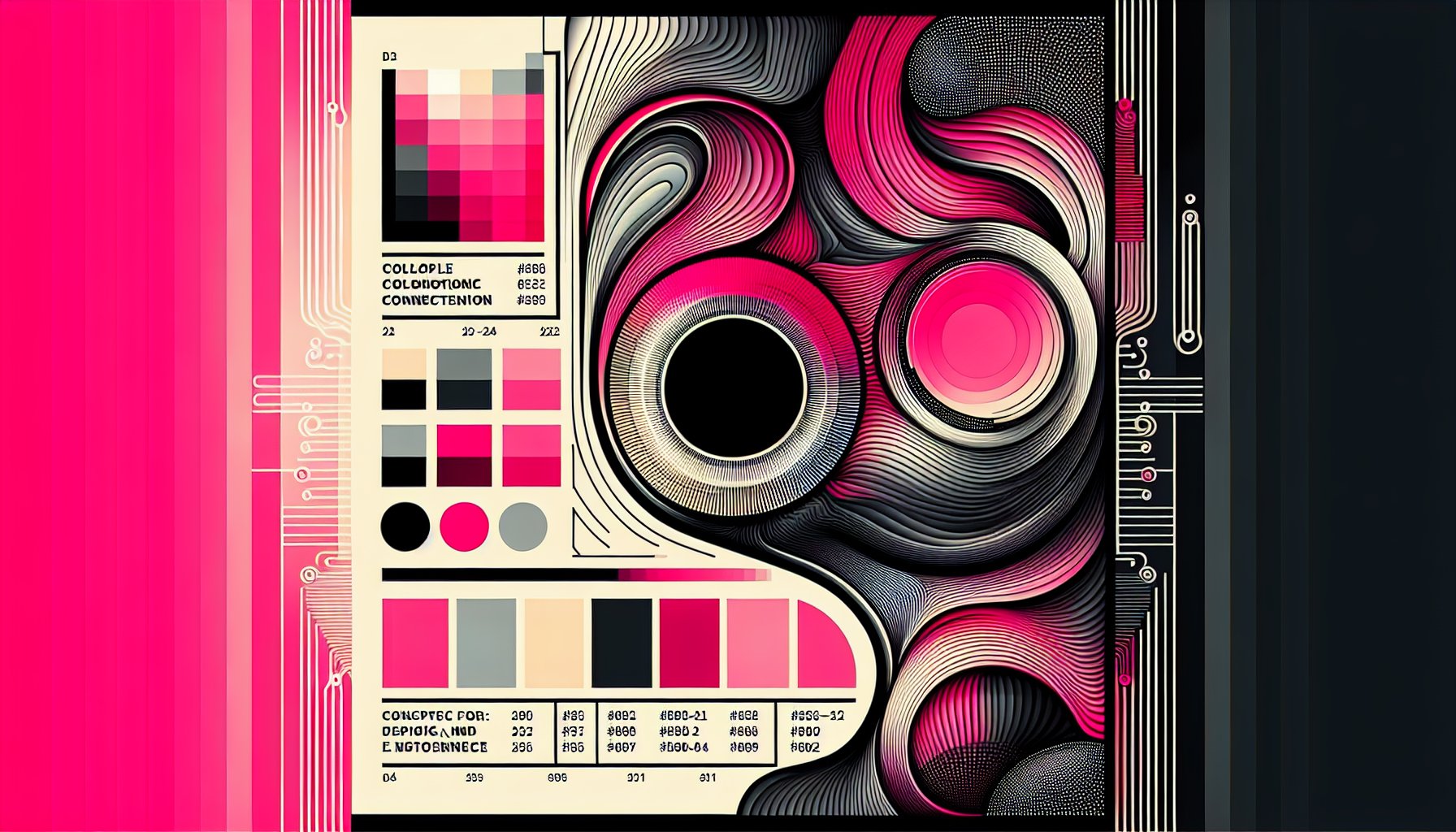
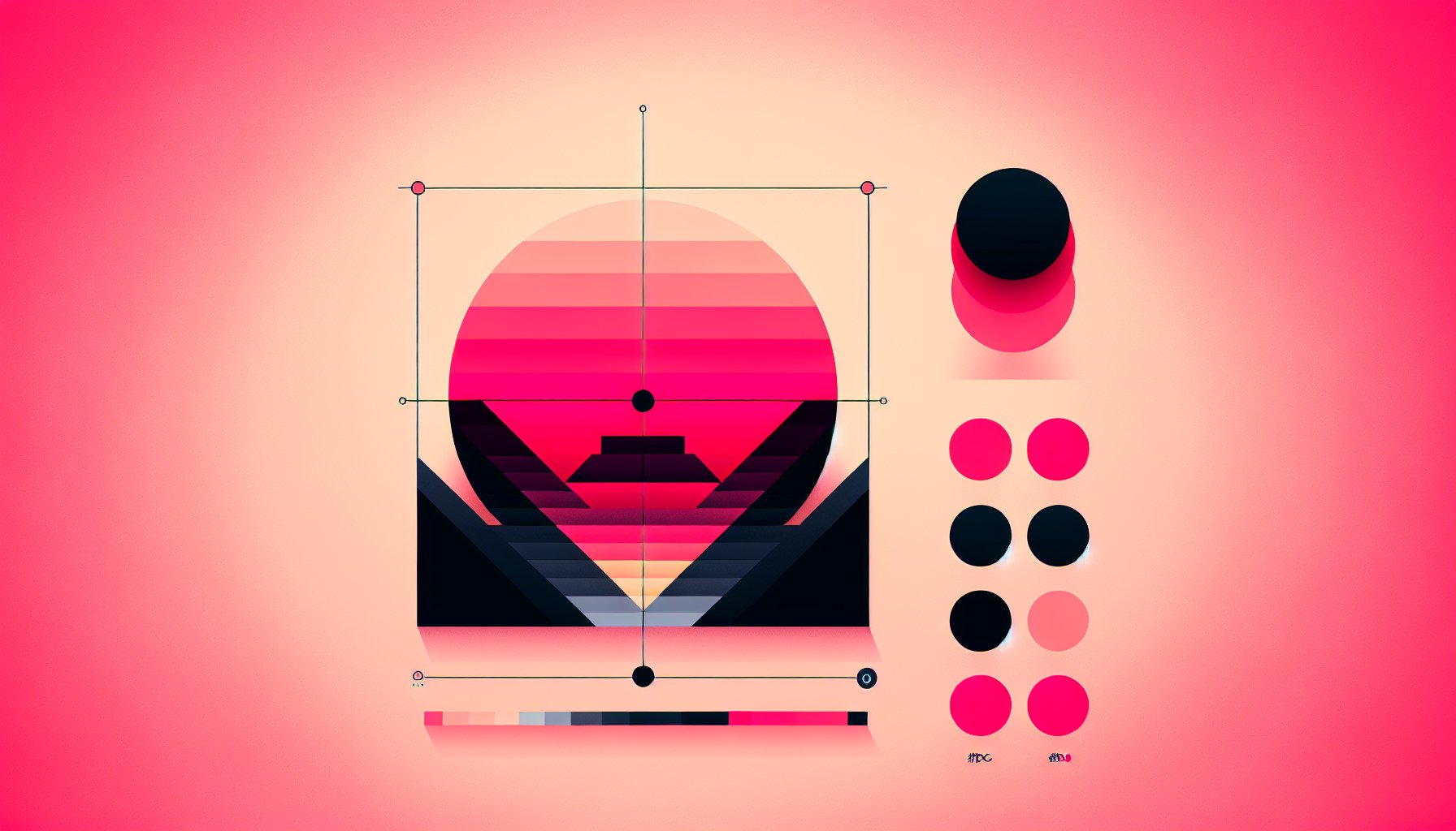
2. Color Conflicts: Harmonizing Your Palette Across Mediums
Color is the life of design, bright and bold on screen, sometimes playing shy on paper. How do you ensure a color's dazzling debut online doesn't end in a drab curtain call in print? The secret lies in understanding the inherent differences in how screens and printers perceive color, and bridging these two worlds with finesse.
When a logo looks magnificent online but falls flat in print, it's a color miscommunication. To avoid this, start with colors that flaunt a dual-lingual flair, those adaptable enough to shine in both RGB's spotlight and CMYK's studio lighting. Monitoring your monitors with industry-standard calibrations is also key. And, don't forget to test! A printed proof is like a dress rehearsal for your masterpiece, ensuring your colors align perfectly before the final curtain.
3. The Size Matters Dilemma
In graphic design, size really does matter, but it's not just about making things bigger or smaller. It's about understanding the intricate dance of resolution, file format, and intended use. From the sleek elegance of a corporate brochure to the impact of an outdoor banner, scaling must be done with precision.
Vector vs. raster, think of them as the tortoise and the hare of design. Vectors are your steadfast companions in logos and illustrations, scaling effortlessly without breaking a sweat. Rasters, though beautiful, can stumble when blown up for print, losing clarity. Hence, when sending designs off to the printer, it's wise to send native design files rather than just PDFs. This ensures they have all the flexibility they need to work their magic.
4. Typography Tango: Choosing Fonts that Dance Across Formats
Typography is more than just letters on a page; it's the silent conductor of your brand's symphony. The challenge? Finding fonts that not only dance gracefully across screens and pages but also speak with your brand's voice.
Consider the setting: a bold font that commands attention from afar on a billboard may rebel when squeezed into a social media post. While serif fonts convey a sense of formality, sans-serif fonts offer a friendly readability online. Technically, fonts must be outlined before heading to print. This means they become immutable artworks, fixed in form. Choose wisely, then convert strategically.
5. Imagery Impact
Images are the heartbeats of design, and their impact can make or break your brand's visual narrative. When selecting visuals, quality is king. High-resolution images (300 DPI, to be precise) ensure your designs don't lose their allure when coming to life on paper.
Using stock images from the internet can be tempting but beware the licensing jungle! Your brand's integrity relies on legally obtained visuals. At CT Marketing Solutions, we believe in using licensed or custom photography to enrich your brand's story, after all, you're not just telling a tale; you're selling an experience.
6. Branding Blueprint: Maintaining Consistency across Platforms
Consistency is the secret sauce of branding. It's not just about matching colors or font sizes; it's about crafting an experience that feels unmistakably "you" across any platform. A hiccup in consistency can confuse and alienate potential customers, something no brand can afford.
Visual and tonal harmony must flow from digital to print. Imagine if your website oozed modern coolness while your print materials whispered outdated formalities. The disconnect could be jarring. That's why a thorough brand style guide is your best friend, your trusty roadmap to maintaining consistent visuals and tone across every medium.
7. Prototyping Your Designs
Prototyping is more than pre-design. It's a conversation starter, a tangible step toward turning visions into reality. At CT Marketing Solutions, collaboration and feedback loops shape ideas into polished deliverables.
Imagine a client with a grand vision for a promotional campaign. Prototyping bridges that vision with reality, allowing for meaningful dialogue. Feedback is your compass, guiding adjustments and ensuring every design decision aligns with the client's aspirations.
8. Print Production Pitfalls
When it's time for print, beware of common pitfalls lurking in the shadows. Misalignment between design files and printing requirements can spell disaster, resulting in muted colors, blurry text, and costly reprints.
Sending native design files offers flexibility, eliminating the risk of communication hiccups. Keep an eye on resolution, ensuring images are at least 300 DPI, and never underestimate the importance of accurate font management. Outlining fonts can save you from licensing issues, ensuring your design's integrity stays intact.
9. Digital Snapshots: Tracking and Analyzing Design Performance
Once your designs are out in the wild, how do you know if they're resonating? Enter performance tracking, the unsung hero of design success. By analyzing user engagement metrics, designers can identify which visuals strike a chord and which need a tweak.
In print, unique QR codes or dedicated landing pages allow you to track engagement levels, offering insights into audience behaviors. The key is fostering collaboration between designers and those analyzing performance, ensuring insights inform future projects.
10. The Future of Design: Emerging Trends and Technologies
The future is here, and it's bursting with potential. AI is revolutionizing creative workflows, offering designers more time for conceptualization. Sustainability is no longer optional; it's a necessity, resonating with consumers who demand eco-friendly practices.
Immersive technologies like AR and VR are reshaping consumer experiences, offering interactive dimensions to design. And as devices continue to evolve, adaptive design ensures your brand identity stays consistent across screens big and small.
In summary, the future of design is an enticing frontier, brimming with possibilities. By embracing these trends, CT Marketing Solutions can offer cutting-edge solutions that meet today's needs while anticipating tomorrow's challenges. So, let's reimagine the boundaries of web and print design, and craft a brand experience that leaves a lasting impression.
Need Help?
Check out these related products that can help:
Other Articles You Will Like
Graphic Design Assistance
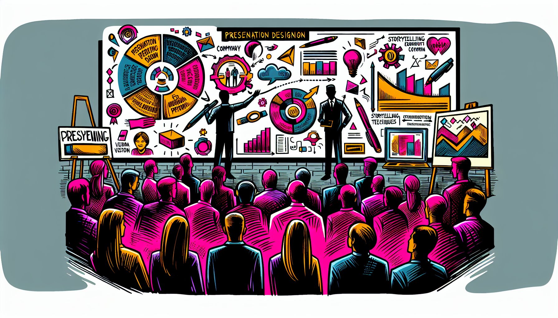
Creating Stunning Presentations: How to Design Slides That Captivate Your Audience
Unlock the secrets to creating stunning presentations that captivate your audience. Learn how to design impactful slides with storytelling, visuals, and interactive elements in 'Creating Stunning Presentations: How to Design Slides That Captivate Your Audience'.
Mar 21, 2026
Read More
Graphic Design Assistance
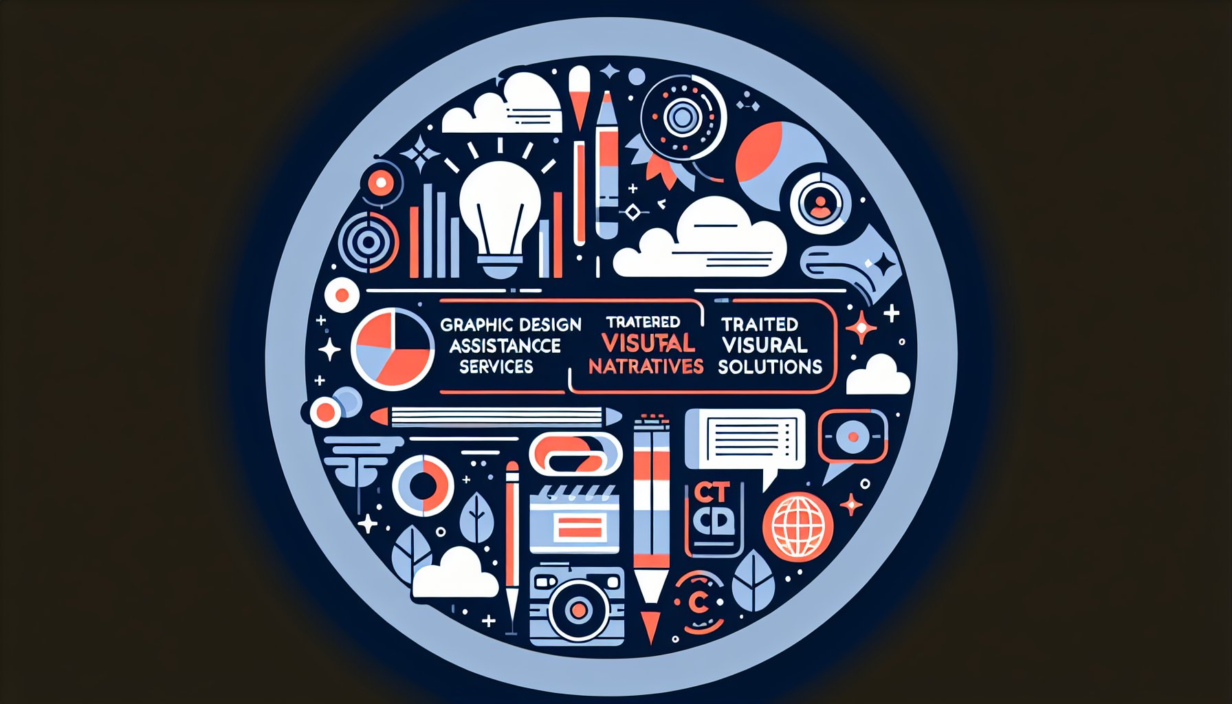
Unlocking Creativity: A Deep Dive into Graphic Design Assistance Services
Discover how graphic design assistance services can elevate your brand. Join CT Marketing Solutions in 'Unlocking Creativity: A Deep Dive into Graphic Design Assistance Services' and learn how tailored visual narratives transform industries and engage audiences.
Mar 19, 2026
Read More
Graphic Design Assistance
How to Use Color Psychology in Graphic Design: A Practical Guide
Discover how to use color psychology in graphic design to enhance user experience and boost engagement. Learn practical strategies to create emotional connections and drive brand loyalty with our comprehensive guide.
Mar 19, 2026
Read More
Graphic Design Assistance
How to Use Adobe Illustrator: Essential Tools and Techniques for Graphic Design
Discover how to use Adobe Illustrator effectively with essential tools and techniques. From mastering the Pen Tool to understanding typography and color theory, elevate your graphic design skills and create stunning visuals that captivate your audience.
Mar 16, 2026
Read More
