
Print Materials
How to Design Eye-Catching Flyers: Tips and Tricks for Effective Print Marketing
Unlock the secrets to creating eye-catching flyers that captivate your audience. Discover essential tips and tricks for effective print marketing with our guide on designing unforgettable promotional materials.
Oct 10, 2025
6 min read
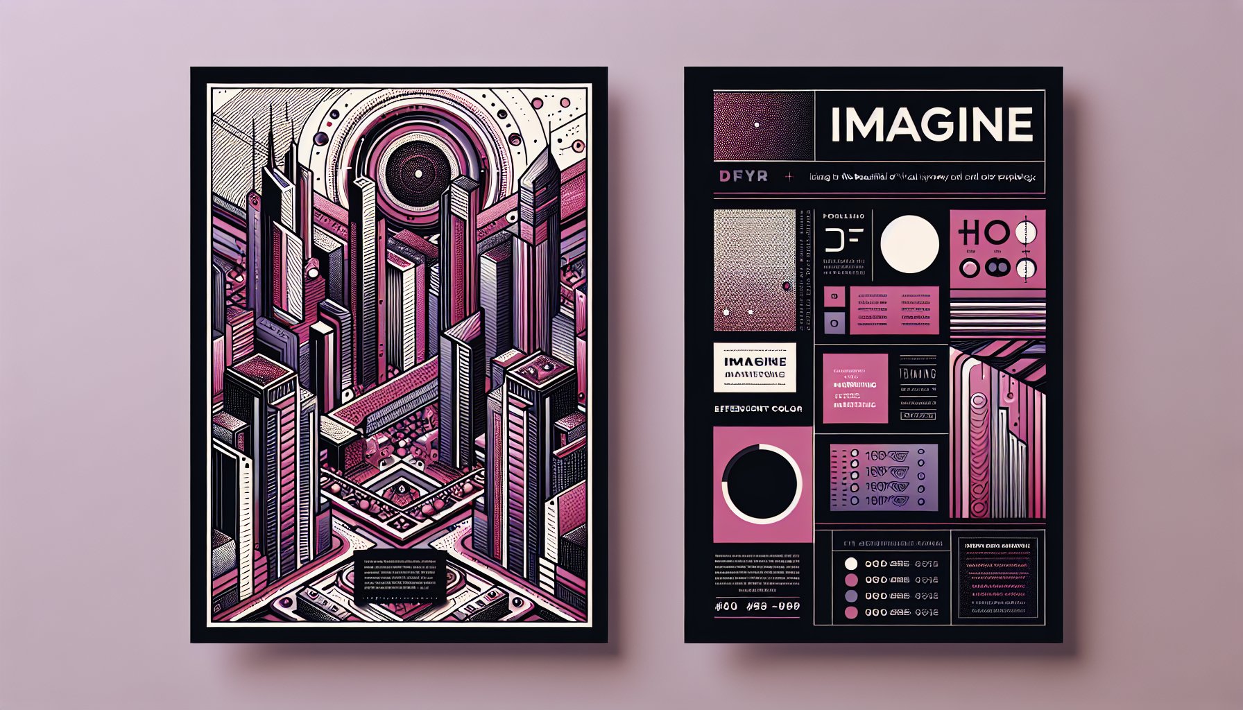
Crafting Visual Allure: The Art and Science of Eye-Catching Flyers
Designing an eye-catching flyer is not just a slapdash art project, it’s a high-stakes blend of creativity and strategy that can make or break your marketing dreams. At CT Marketing Solutions powered by Proforma, we get it: A flyer isn’t just a pretty face; it’s your brand’s opening line, its first impression. Will it intrigue or will it fade into the ether? That’s why creating a flyer with visual allure is about more than just turning heads, it’s about stirring emotions.
Meet Your Silent Salesperson
Imagine a flyer as your brand's stealthy sales rep, passionately whispering about your latest offer. The initial design elements have to grab hold of attention, think graphic images, vivid colors, and standout fonts that tug at viewers' hearts. Take a Cinco de Mayo bash flyer, for example: It should pop with vibrant yellows and greens, flanked by playful typography that screams fiesta. All these elements are choreographed using color theory and psychology, as they dictate how people emotionally respond to visual stimuli.
But let’s not stop at aesthetics. Creating a flyer means diving into human behavior and the science of memory. Research tells us that people remember 65% of information when it's paired with images, versus a measly 10% when it's just words. So, splash that flyer for your restaurant's new menu with drool-worthy photos of your fan-favorite dish, it’s not just tempting; it’s memorable.
Visual Hierarchy: The Secret Sauce
The layout? That’s your GPS for the eyes. Effective use of white space enhances readability and spotlights your CTA (call-to-action). An overcrowded flyer? Think of it as a party invite written in hieroglyphs, confusing and easily dismissed. Aim for an organized design that naturally guides viewers through the content, like a visual road trip that ends with a drive to your website or a call to learn more.
Understanding your audience is pivotal. At CT Marketing Solutions, we are all about messaging that speaks the local dialect of your target demographic. A good flyer doesn’t just look great; it serves as a bridge from curiosity to commitment, transforming glancing interest into enthusiastic action.
Psychology and Design: A Match Made in Marketing Heaven
The human brain is a busy place, constantly bombarded by visual stimuli. To stand out, an understanding of the psychology of attraction is key. Our minds respond to color with the fervor of kids in a candy store, warm hues like red crank up urgency, while cool tones like blue whisper trust and calm.
Visual hierarchy in a flyer isn’t just an artful arrangement, it's a structured invitation to your audience, guiding their eyes from the headline to the images and ultimately to the CTA. Think of it like a well-told story, where each element unfurls a new chapter of your brand message.
Crafting a Symphony of Design Elements
Creating a flyer is like conducting an orchestra. Each element, color, typography, imagery, and layout, must work in concert to harmonize your message. Color is your emotional palette: A fiery red might accelerate the pulse, while a soothing blue can calm and reassure. Typography isn’t just about readability; it’s the font that conveys your brand’s voice, whether it’s playful and quirky or sleek and sophisticated.
Imagery should narrate your story. Forget the ho-hum stock photos; opt for visuals that truly resonate. A picture of a bustling event or a product in action can forge a connection in a way words often can't.
From Concept to Creation: Behind the Curtain
Designing a flyer is a journey from concept to creation through four strategic phases: Exploration, Conceptualization, Creation, and Implementation.
- Exploration: Think of this as the groundwork, knowing your audience and what makes them tick.
- Conceptualization: Where ideas take flight, transforming creative sparks into tangible concepts.
- Creation: The art of bringing your flyer to life with expert design tools, making every pixel count.
- Implementation: The grand reveal, where your flyer makes its debut, strategically delivered to engage and convert.
Color Your Brand: A Tactical Palette
Colors aren’t just there to make things pretty; they're strategic tools that convey messages and emotions. The trick is in selecting hues that resonate with your audience while aligning with your brand identity. Seasonal palettes, consistency with brand colors, and accessibility are all parts of the color calculus in marketing.
Font-astic Choices: More Than Meets the Eye
Typography, the unsung hero of design, bridges visual appeal with textual clarity. Your font choice is a voice in your customer's ear, whispering either reliability or irreverence. It’s about hierarchy, readability, and a splash of color for emphasis.
Turn Stock into Story: Imagery that Resonates
Imagery is the soul of your flyer. Skip the stock and opt for original photos that capture the essence of your message. Align these visuals with a thoughtful color scheme to create compelling, relatable marketing pieces.
The Call-to-Action: A Whisper or a Shout?
Your CTA is the crescendo of your marketing symphony. It should compel action, not just suggest it. Infuse it with urgency and clarity, ensuring it’s the last and loudest note your audience hears.
Print vs. Digital: A Harmonious Duo
In today’s world, print and digital are no longer foes. They’re partners in a marketing waltz, where print provides the tangible allure and digital extends reach and engagement. A flyer isn't just a paper handout; it’s a doorway to deeper digital interactions, integrating the tactile with the virtual.
Measuring Success: More Than Just Numbers
Metrics go beyond counting flyers or clicks. Success is measured in engagement, conversion, and brand awareness. Through smart CTAs and integrated digital elements, you can capture actionable data and fine-tune your strategy.
Sustainable Flyers: Green is the New Black
In an age where eco-consciousness is king, choosing sustainable materials for your flyers isn’t just smart; it’s imperative. From recycled papers to soy-based inks, sustainable choices communicate commitment to both quality and the planet.
In the grand scheme of print marketing, a flyer crafted with care, strategy, and creativity becomes more than just promotional material, it becomes a story, an experience, and a call to action. At CT Marketing Solutions, we’re not just creating flyers; we’re designing unforgettable brand moments. So, ready to make your flyers pop? Let’s make magic together.
TL;DR
Creating compelling flyers is about mixing art with psychology to grab attention and convey a message seamlessly. It involves understanding color psychology, typography, and imagery to connect with your audience. At CT Marketing Solutions, we guide clients through a strategic process from conception to implementation, ensuring every flyer is not just visually stunning but strategically effective. By blending print with digital, leveraging eco-friendly materials, and providing clear, compelling calls-to-action, we transform ordinary flyers into powerful marketing tools that drive results.
Need Help?
Check out these related products that can help:
Other Articles You Will Like
Print Materials
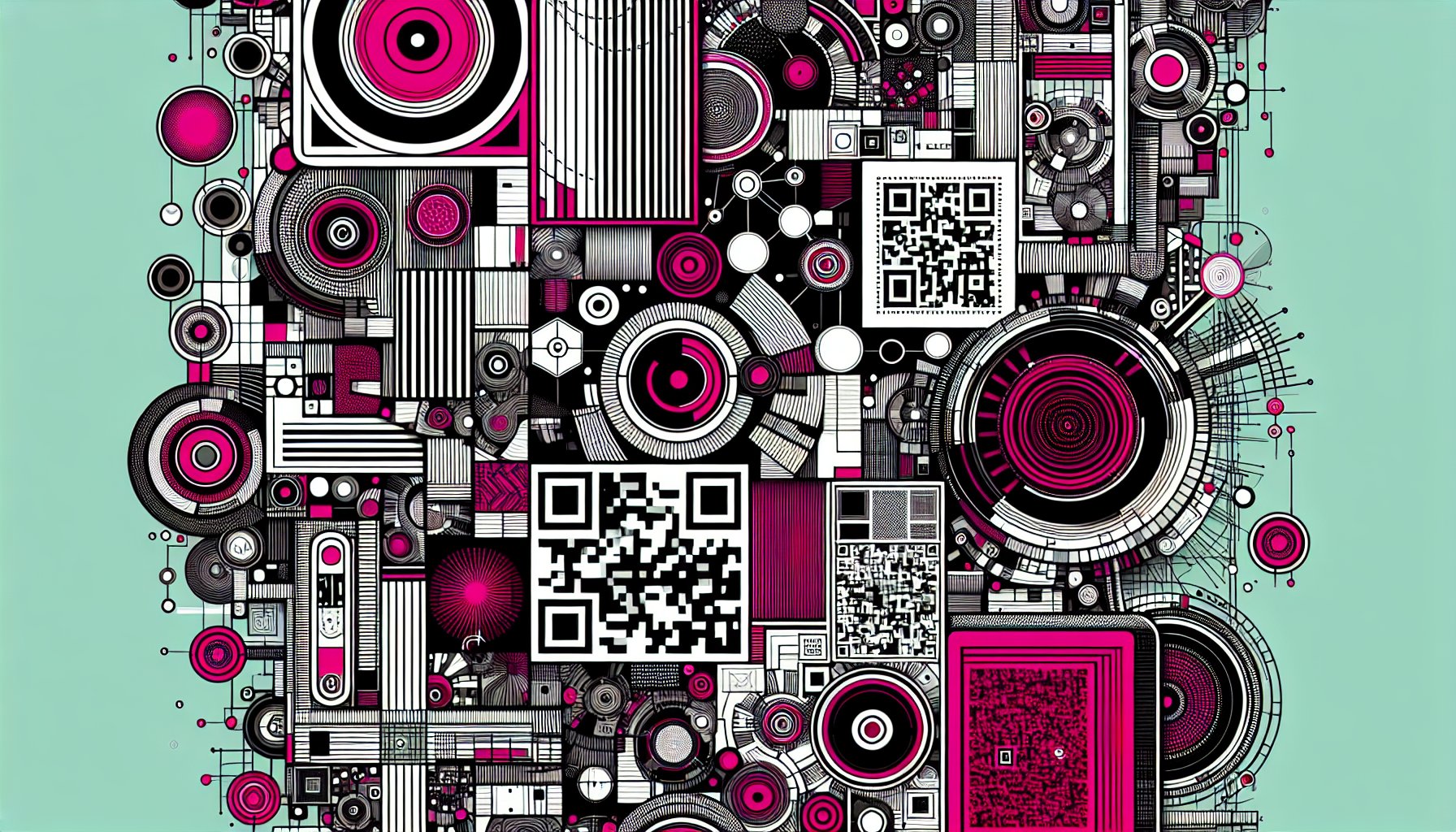
How to Incorporate QR Codes into Print Materials for Enhanced Customer Engagement
Discover how to effectively integrate QR codes into your print materials for enhanced customer engagement. Learn strategies to create memorable experiences, gather insights, and foster brand loyalty with this innovative marketing tool.
Feb 23, 2026
Read More
Print Materials
How to Create Stunning Brochures: Step-by-Step Tutorial for Beginners
Unlock the secrets to creating stunning brochures with our step-by-step tutorial for beginners. Learn design tips, content strategies, and distribution methods to captivate your audience and elevate your brand.
Feb 23, 2026
Read More
Print Materials
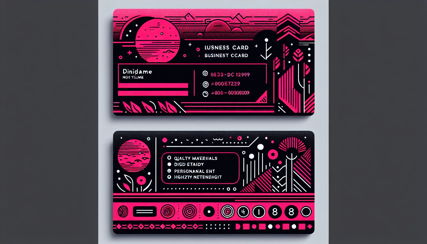
How to Print High-Quality Business Cards That Leave a Lasting Impression
Discover how to print high-quality business cards that leave a lasting impression. Learn about materials, design, and personalization techniques to create a card that truly represents your brand.
Dec 01, 2025
Read More
Print Materials
How to Optimize Your Print Materials for Maximum Impact: A Complete Guide
Discover how to enhance your print materials for maximum impact. This complete guide covers design, material selection, distribution strategies, and sustainability to help your brand stand out in a digital world.
Nov 29, 2025
Read More
Print Materials
How to Craft Engaging Newsletters: A Tutorial for Effective Print Communication
Unlock the secrets to crafting engaging newsletters with our comprehensive tutorial. Learn how to connect with your audience, design effectively, and measure success for impactful print communication.
Oct 30, 2025
Read More
Print Materials
How to Use Print Materials to Boost Your Brand Visibility: A Practical Guide
Discover how to use print materials to enhance your brand visibility in a digital world. This practical guide reveals strategies for integrating print with digital marketing, creating memorable experiences, and measuring impact effectively.
Oct 26, 2025
Read More
